Executive Summary: USDA is projecting prices in the range of $5.70 for the 2021-22 corn crop with an increase in supply, reduction in total use, and increase in ending stocks. That price area is inconsistent with the WASDE numbers for last year and the new year. The 2021-22 price projections only make sense if USDA is projecting a major shift (increase) in the demand curve for corn from 2020-21 to 2021-22. The point of this discussion is not to challenge or question whether the projected shift is correct, but rather to understand what major factor is not accounted for in USDA’s S&D format that will explain a shift that would make buyers willing to pay $1.30/b more in 2021-22 for the same quantity of corn they were only willing to pay $4.35 in 2020-21. The practical reason the question needs an answer is because many producers believe the production estimates are too high, and the consequences are significant if this puts in motion expectations that prices will rally from $5.70 and encourages producers to hold when prices may be poised to drop to the $4.00-$4.50 range or lower.
This is the second article in a series discussing corn demand in general, but now focusing on details about the 2021 corn crop. I apologize for not taking time to produce a slick and glossy graphic, but this is a working model, and it was quicker to pencil in the specific information rather than create a combination chart with both lines and scatter points. 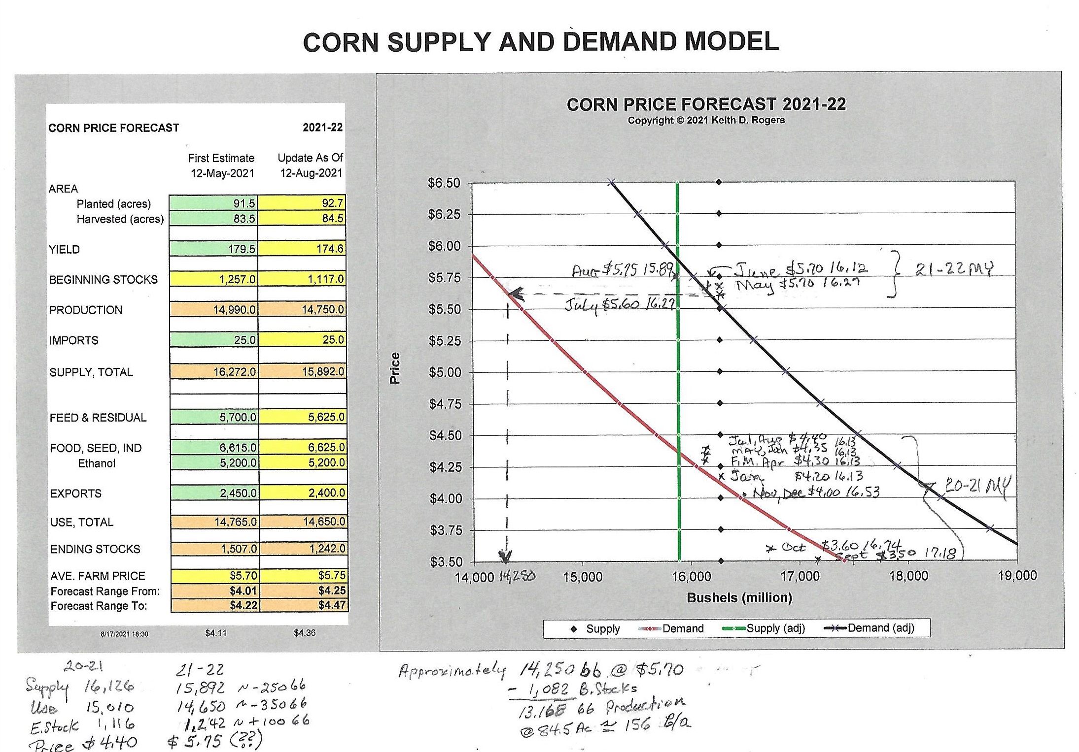
First, let me quickly create a context for what you are looking at. The table at the left part of the graphic is the format that USDA releases as the WASDE report monthly. The two columns are the first projections for 2021-22 which were released in May, and the second column is the projections released in August. Each month, new supply numbers can be entered in the second column, and the impact reflected in the chart on the right.
At this point in the production and marketing cycle, there will be very little supply response to price, so both supply estimates are represented as vertical lines. The May estimate is represented as black diamond dots, and the August estimate is represented by the solid green line. The red curve in the lower left part of the chart is a proxy demand curve with the 2020-21 monthly price and quantity estimates plotted in pencil. The black curve above it is an implied increase in demand that is necessary to put the early 2021-22 supply intersections with demand at the estimated price levels that USDA is reporting.
Perhaps inserting a note here about why the chart was developed will also help set the stage. The goal was not to try to do a better job of estimating demand than USDA, but it was to generate a quick and practical way to determine how much impact specific changes in supply would have when multiple numbers and ranges for total supply are being circulated. The goal was to establish a base from which to measure change, not necessarily the absolute price levels.
The alarm bells went off when the May 2021 WASDE report was released. The first alarm was the estimated yield of 179.6 bpa in face of the wide spread drought conditions. That controversy is, and will be on going for some time, but is the exact reason the model was developed. By plugging in a new yield estimate, a new supply is estimated and the shift of the adjusted supply intersecting with the red demand curve produces an estimated price change consistent with S&D price discovery. Since the model is not designed to estimate actual yield, the uncertainty of the final yield is recognized, but fine tuning the yield estimate is beyond the scope of this model or discussion.
The second alarm bell was when USDA estimated the average farm price at $5.70 in May for 2021-22. The price estimate is inconsistent with a modest increase in supply from 16.127 bb in 2020-21 to 16.272 bb for 2021-22, a decrease in total use from 14.870 bb to 14.765 bb, and an increase in ending stocks from 1.257 bb to 1.507 bb. The price estimate on that same May report for similar supply, total use, and ending stocks for 2020-21 was estimated to be $4.35. Simply said, there is an implied jump in demand of $1.35/b at the same time total use is down and ending stocks are up. Yes, it is an estimate for a new year and the demand curve should be expected to shift slightly to the right (or upward) based on factors that go into producing core demand. But USDA’s numbers reflect a slight decrease in demand, not an increase.
What is the point? Many producers are still developing and implementing marketing plans based on many analysts talking about higher demand and tighter supplies which would be expected to drive up price. If the assumption about a significant demand increase and tighter supply is true, the right strategy is to hold inventory and wait for the rally from $5.70 to unknown levels. On the other side of the coin, if the real expected price is in the low $4.00 range, a lot of money is going to be left on the table when corn could have been priced now or anytime in the last several weeks well over $5.00.
What is the real price expectation? Let’s bring the yield question back into the discussion. Let’s say the acreage estimates are correct, but the yield estimate is too high. How much impact will a lower yield have? A common belief on the street is that price will rally from the $5.70 level. Certainly, price will rally if the yield is lowered, but the question that needs to be addressed is how much and from what starting point? First, trace the horizontal dotted line from the implied demand curve back (to the left) to an intersection with the original demand curve at the $5.60-$5.70 level, and then drop down to the supply axis. Pricing off the original demand curve implies that total supply would have to drop to something in the range of 14.250 bb and with the projected 1.082 bb of beginning stocks. That implies that production would have to drop to 13.1 bb, or a yield of 155-160 bpa. Very little discussion is focused on a yield estimate that low, but 170 bpa is kicked around as a lower estimate. At 170 bpa and 84.5 mha, production would be 14.365 bb, or roughly a billion bushels over the total supply that would project an average farm price in the $5.60-$5.70 range.
I certainly do not have the resources to produce a comprehensive S&D model for corn that can compete with several private companies or USDA. And, regardless of the accuracy of this analysis, no recommendations are made to sell or hold. The statement is pure and simple; I can’t reconcile USDA’s price estimates with USDA’s S&D numbers. The potential inconsistency of the numbers should at least be an alert to review the budget and see what the impact would be if price is expected to be in the middle to low $4.00 range instead of a setup for a rally above the projected $5.70. If the goal is to lock in prices to cover cash flow, there is still time. If there is, in fact, a huge hidden shift in demand, then the opportunity will still be available to use the futures market to follow the trend up.
To summarize briefly, the 2021-22 price projections only make sense if there has been a major shift (increase) of the demand curve for 2020-21 corn to 2021-22 corn. The point of this discussion is not to challenge or question whether USDA’s projections are correct, but rather to try to identify what major factors are not accounted for in USDA’s S&D format that explains a shift that would make buyers willing to pay $5.70/b in 2021-22 for the same quantity of corn they were only willing to pay $4.35 in 2020-21.
Comments and insights are not only encouraged, but solicited and requested, to move the discussion along and help improve the understanding of the role of the demand component in S&D interaction for price discovery.
Posted by Keith D. Rogers on 15 September 2021