Executive Summary. The distinction between demand and quantity demanded is critical in price discovery. Demand is the quantity that consumers will buy at various prices, while quantity demanded is the quantity the consumers will buy at one specific price in that array. The two critical components in price discovery are the estimated total supply and total use during a specific time frame. For seasonal crops, that time frame is normally one crop year. While a demand function is rarely seen, if ever, the term “demand” is used multiple times a day, and most often incorrectly. The misinterpretation leads directly to many inaccurate price projections. In fact, there is an annual demand function for U.S. corn, and it can be approximated with relatively simple tools and methods. While there is a high correlation between USDA’s estimated supply and that demand function, no simple model can capture all of the factors that define a demand function, and corn is no exception. The consequences of making marketing decisions while denying or ignoring the existence of a demand function can lead to totally unrealistic price expectations and disappointing marketing results.
Changes in corn “demand” are discussed daily, and with little second thought. I recently shopped around some questions asking if anyone had ever seen a corn demand function. The replies and silence were shocking. A graphic like the one below or a single quantity value are the most common perceptions of demand. It is unlikely that any meaningful discussion about price discovery and price projection can get very far off home base because folks have widely different perceptions of what demand is and how it can be used to make price projections.
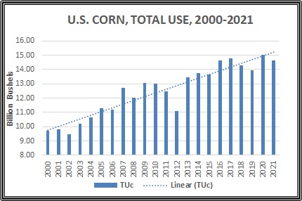 This graphic is one example of the type of answers I got, and it is an excellent example of several things that can go wrong on the way to estimating price. This graphic is bars showing U.S. corn use from 2000-2020, and an estimate for 2021, nothing more. The trend line is an automatic calculation and overlay by Excel. The quick and easy interpretation is to say that the demand for U.S. corn is increasing, and it should have been nearly 15.0bb in 2019 or over 15.0bb in 2021 and beyond. But the actual USE in 2019 was less than 14.0bb and is not projected to reach 15.0bb in 2021. What is wrong with saying that demand is projected to be over 15.0bb in 2021?
First, the economic definition of demand, a demand function, or a demand curve is the quantity of a product or service that consumers are willing and able to buy at various prices during a given period of time. The graphic is not a representation of a demand function at all, and not even points on a common demand function. Simply put, this graphic only tells how many bushels of corn were used in particular years. Good information, but there is no association with price. What the trend line indicates then is an estimate of the amount of corn that will be used if ALL OTHER THINGS that have been creating demand for corn continue on a similar level in the future. This graphic is a historic time series, and nothing more. It has very little independent predictive power unless you are prepared to accept that ALL OTHER THINGS will remain the same.
What are some of the other components in demand for corn? Just to name a few: domestic and world population, per capita income, price and supply of competing product, oil price and use, exchange rates, etc. The dotted line assumes all of this grows proportionately, and a lot more without any documentation or support. A trend out of context is little more than a talking point. The most dangerous thing about this chart is that it creates the impression that quantity demanded will continue to increase without any regard for the logical response of reducing quantity demanded when price increases. An upward sloping function definitely is not a realistic expectation for a demand curve. If Use is being projected one month at a time, it may be a reasonable estimate. But when working across multiple years and even decades, assuming ALL OTHER THINGS remain constant is not reasonable.
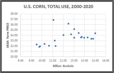 In order to work toward a true demand function, it is necessary to associate quantities bought/sold with specific prices. Consider the chart to the left as a preliminary approach to sorting out some of the loose ends. This is the same quantity values as in the previous graphic, but now associated with prices. A quick glance says that if Excel is asked to draw a trend line, it might be either upward or downward sloping. On a closer look, there appears to either be two groups of data, or one group with a large number of outliers. In both cases, the suggestion is that there has been a significant change in the “ALL OTHER THINGS EQUAL” that are not disclosed in a simple two-dimensional P&Q relations. One thing is obvious without any other information or knowledge. All seven of the data points in the lower left corner represent sales at or below $3.00, and before 2007. Potentially this might signal a major structural change in the market. You should give some thought to what may have changed, but the discussion will proceed with the assumption that there was a structural change. If the seven data points are removed to embrace the new market structure, Excel has no problem placing the trend line in a downward sloping position that is consistent with normal response to price changes.
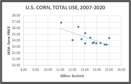 Corn demand function? Not yet, but perhaps closer to believing that it is possible. Next, is the problem of identifying what else is in the Q=f(P) relationship on a demand curve that has not been dealt with and is causing noise in the system that makes isolating a P&Q relationship neither easy nor intuitive. While there is a decent correlation between P&Q for the 2007-2020 data, 77.5% will only translate to explaining about 60% of the variation in price for similar quantities. By the time that is translated into a confidence interval, anyone could guess a number that would fall in a range that wide. So, if people giving advice about price expectation lack a basic understanding of the demand function for corn, it is little wonder that there is a wide range of prices circulating.
Thanks to some suggestions and tips from interested members in the Grain Marketing Discussion group on Facebook, the mathematical demand function was expanded to include factors other than price that might affect the intensity of desire to buy specific quantities of corn for higher or lower prices. The regression structure pushes composite correlation between P&Q with additional variables up to 95% by quantifying some of the variation, and allows the system to explain 90% of the price variation. Not perfect, but quick and dirty for the time I had. Below is a rough linear approximation of a demand function for U.S. corn on an annual basis at farm level price.
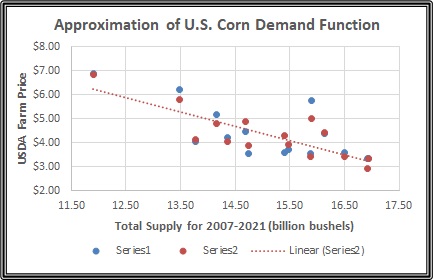 Please look closely. There is a pair of blue and orange dots for the specific annual use quantities, so the pairs are in a vertical relationship. Where there appears to be only an orange dot, the estimated price is so close to the actual price that one dot is on top of the other. Where there are pairs of blue and orange dots separated in a vertical relationship, or the pair of dots are off the trendline, it is due to OTHER FACTOS not quantified in the regression model. The pair of outliers between 15.50 and 16.50 and above $5.00 are the USDA projections for 2021-22 marketing year raise some interesting questions.
So, what are all of these points? The WASDE report or S&D relationship which is released every month provides Beginning Stocks, Production, and Imports, and is reported as Total Supply. Total Supply is assumed to be a given, and rarely is there any reference to a price response of supply or a supply function. In fact, there is a supply function just like the demand function where the quantity supplied is a function of price and other factors, but those decisions are basically made long before the marketing year begins. That is to say that supply really is treated as a fixed amount or a vertical line on a graphic or chart. There are quantity changes from month to month based on changing estimates of Beginning Stocks, Production, and Imports, but the changes are primarily to try to reach a final accurate estimate of the total supply, and not a function of price response.
In theory, each actual P&Q point is where a vertical supply estimate crossed a common demand curve for price discovery for that quantity. In practice we do not have ALL of the factors accounted for in the demand function, so there are some unexplained variations. But rarely is the any significant change in demand. Most often, the comment that “demand is up or down” really is reference to more or less grain being sold at higher or lower prices along the demand curve rather than the entire function shifting.
Case in point. There has been much discussion of how much the demand increased or decreased for the 2019 crop because of an international trade war, a COVID pandemic, and other 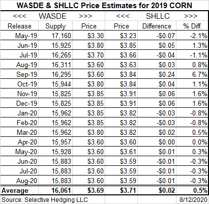 political, social, and economic conditions. To the left is a table that was posted several months ago with the actual prices for 2019-20 crop, starting with the first WASDE estimates in May 2019 and running through the end of the marketing year in August 2020. The SHLLC price estimates were generated with two things: 1) monthly WASDE supply estimates, and 2) a proxy demand curve developed many years ago for personal use. The point is that the same “demand curve” was used to generate all of the price estimates with reasonable accuracy, suggesting that the demand curve was fairly stable throughout the 2019 crop cycle.
There are other ways to estimate farm prices, specifically using the futures market, and I am hoping that posting this article will stimulate interaction with folks who have other approaches to price discovery. This article is also a lead up to a second article dealing with what appears to be a significant difference between the implied demand curve for 2020-21 and the implied demand for 2021-22, as noted by the deviation of the USDA estimate of price in August from the demand curve. The bottom line is that if demand is overestimated and creates the expectations of significantly higher prices, many producers are going to end up hold an inventory that turns out to be worth much less than they are anticipating.
Posted by Keith D. Rogers on 12 September 2021.