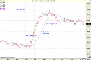
It has often been said that a picture is worth a thousand words. In particular, let’s focus on the December 2012 Corn futures contract. Few would deny that the CZ12 contract was a weather driven market, and as late as March and April none of us could project what was going to happen in July and August.
Going into June, the general consensus was that we had a record or near record crop underway, and that price risk management should be focused on protecting against falling prices. Many would say that it was impossible to anticipate the significant rally or the subsequent price drop that followed later in the year. I strongly disagree, but it doesn’t matter what I think if the picture is not clear to you.
In an earlier post, I suggested that if you are new to technical analysis you might want to start with a simple moving average crossover, and you might want to start with five day and thirty-five day moving averages. I don’t suggest this is a perfect indicator or even one of the best indicators, but it is simple and easy to understand. On the chart below, the five day average is plotted as the red line, and the thirty-five day average is plotted as the blue line. The simple application is that when the red line crosses down through the blue line, you have a sell signal. When the red line crosses up through the blue line, you have a buy signal. Look closely. The red line normally cuts down through the blue line at or very near the top of the blue line, and cuts up through the blue line at or very near the bottom of the blue line. For all practical purposes, the blue line tracks the major trend, but it is easier for some folks to recognize the tops and bottoms with the crossover.
 Through the early part of 2012, the general trend (blue line) was down. The red line rallied above the blue line for very brief periods in February and March, but the significant turn came on June 19 when the red line crossed up through the blue line (market closed at $5.635) and the five day average raced away from the thirty-five day average. On September 6, the red average crossed down through the blue average, and the market closed at $7.985. Both were very clear signals that are easy to understand and interpret. Neither signal came at the extreme top or bottom of the market, but both were very timely. Knowing that you should lift your hedges, or put other protection in place at $5.635 and should sell at $7.985 for a gain $2.35 per bushel, or approximately $400 per acre, is significant. True, this only captures 70% of the total move ($5.0525 to $8.40), but that is well above the 60% goal I set for myself many years ago. I challenge that few other objective strategies, that could be reproduced, were even close to this performance.
Look closely for yourself and decide if something as simple as a moving average crossover would help you decide what the market trend is and what risk you need to be managing. I hope the picture tells the story for you. Comments welcome on the Discussion page.
Foot note: A keen eye will notice that there were crossovers before June and after September. I specifically chose not to address those crossovers so that the focus would stay on the big picture, and not get distracted by issues that can be handled separately. I will address the fine tuning later, but trust me for now to say that there are some relatively simple techniques which facilitate fine tuning.
Posted by Keith D. Rogers on 29 April 2013


